Finding classes on the Mirror
MIRROR wants to make finding a class easier and provide the option to save searches.
Responsibilities
Designed the user experience and interface for iOS/Android and MIRROR platform.
Lead brainstorm sessions to better understand our challenges and solutions.
Conducted competitor research and pulled visuals for design inspiration.
Presented various rounds of prototypes to stakeholders.
Worked with Product Manager, QA, iOS and Android Engineering for product shipment.
The goal
Make finding a class easier by exposing all filtering options in one view while broadcasting:
Trainer diversity, classes types, and other custom class preferences.
Create a shortcut experience that allows users to save their searches for quicker access and reduce overall taps throughout the UX.
Design requirements
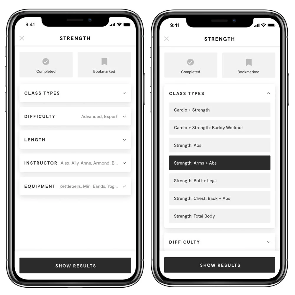
Add a top-level filter button to all class genres.
Expose all options from drop-downs and organize by level importance.
Add new user-requested options like “Floor Only” and “Not Taken by Me”
Allow users to save their searches on all filtered requests.
Carve out a new area that gives users quick access to their saved searches.
What are other people doing?
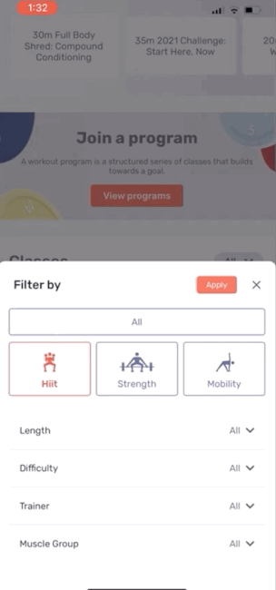
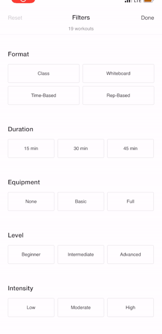
We found that most of our competitors relied heavily on drop-downs and bottom sheets to hold their filtering options–making the user do all of the work and performing more clicks to get to what they want.

Peloton
Peloton users have to tap into drop-downs to view hidden filters. This causes more clicks and a longer user experience.
Tempo
Tempo similarly nests their filters within drop-downs that launch sheets that sometimes take over the screen’s entire viewport.
Nike
Nike has an open concept, but fails to indicate options that are available vs non-available. IOW, there are no in-active states. This lands users on a no-results page without an explanation.
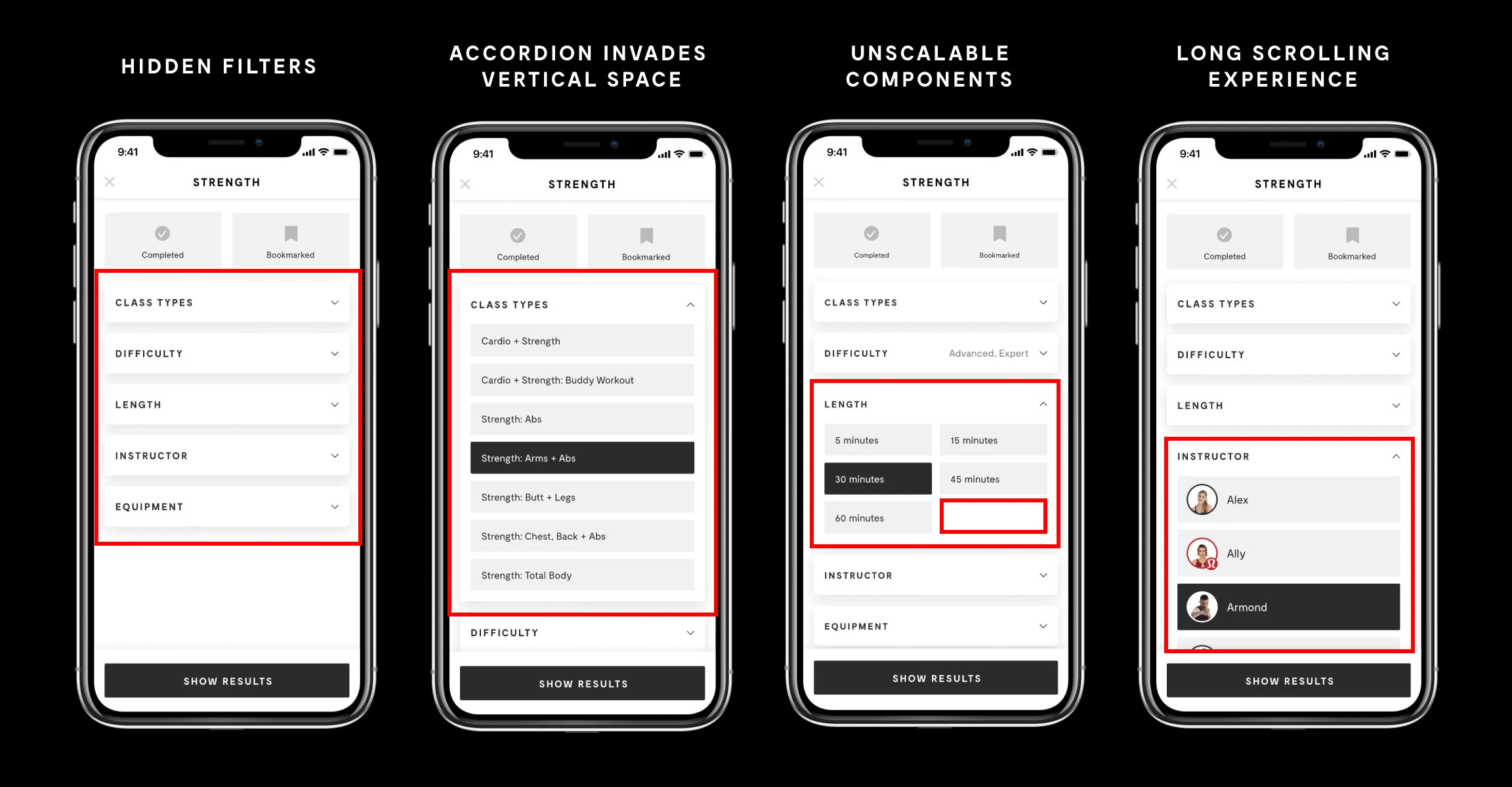
What’s currently not working
We require the user to do all of the heavy lifting to uncover their options because all of our filters are hidden–leading to more taps and time spent not working out.
We do a poor job showcasing content diversity.
We provide no class overview and general education to help guide our users.
The components aren’t built to scale.
Our approach
We listened to our users when they told us that our filters were “too hidden” and they wanted to be able to save their searches. With that, we sketched a few iterations around what our filtering system could look like if we exposed all of our options in one view. Below are a few iterations we explored for “Finding a Class” and “Shortcuts.”
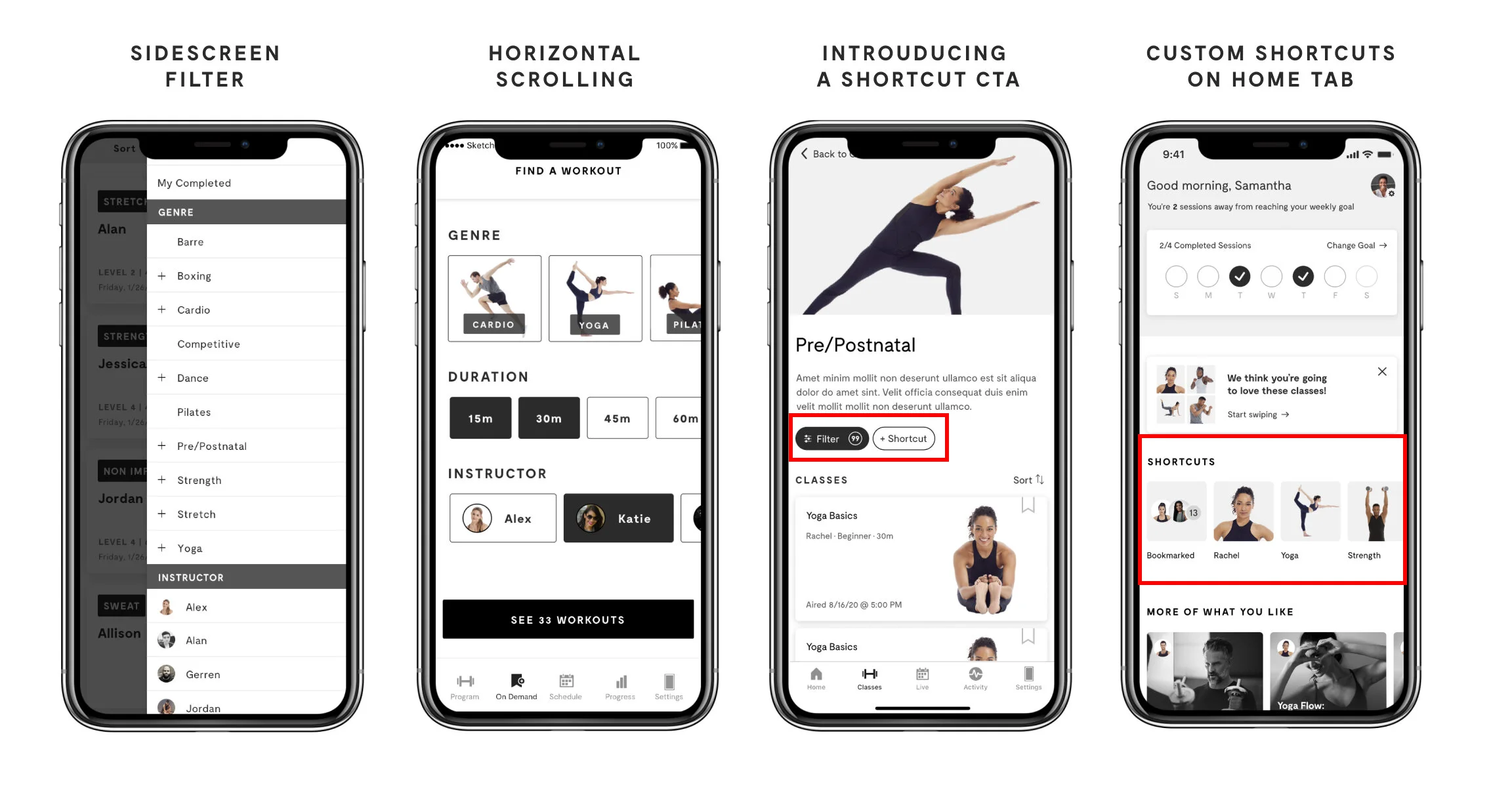
What we came up with
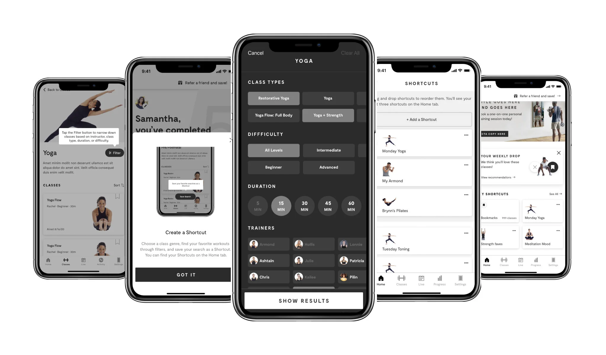
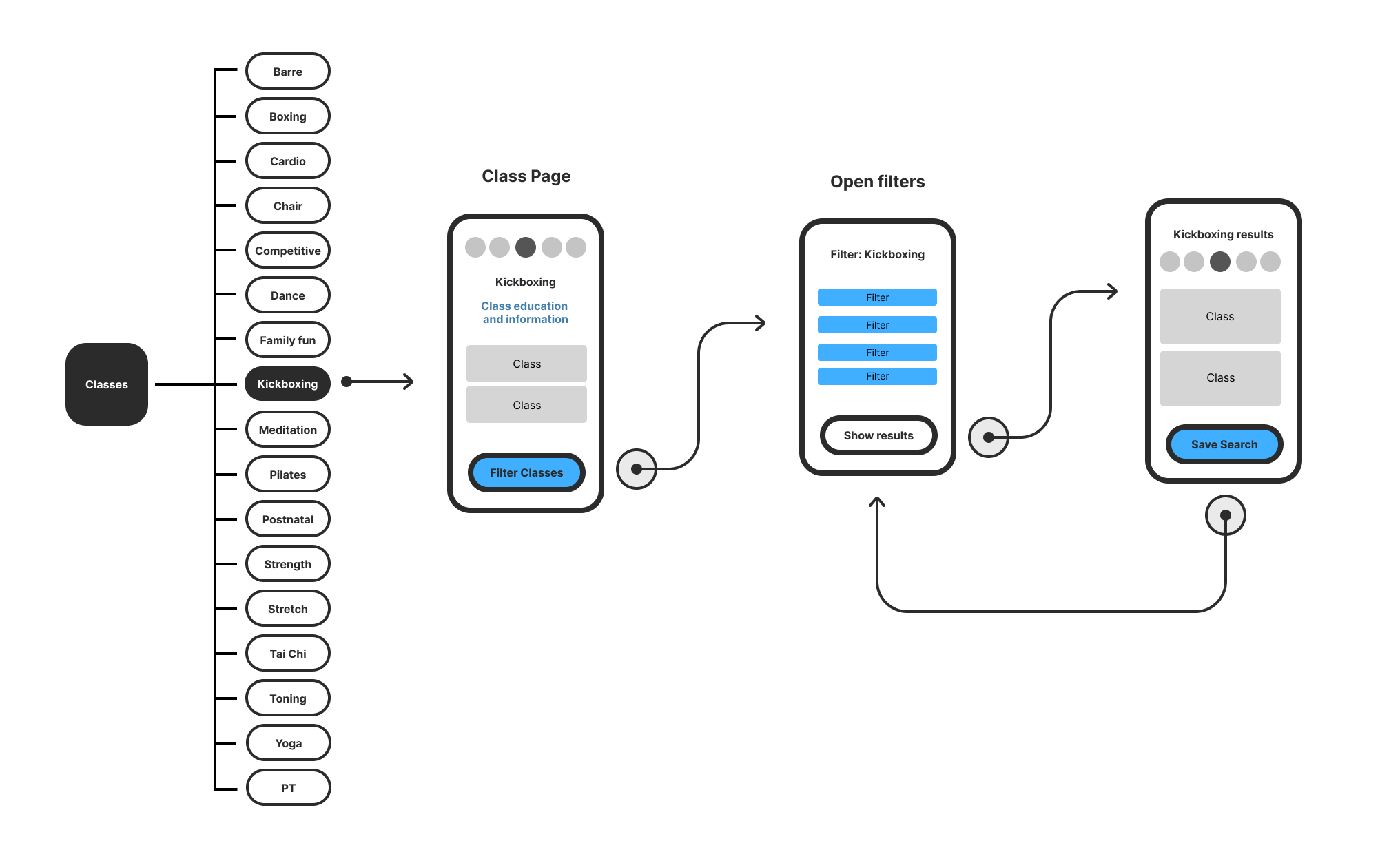
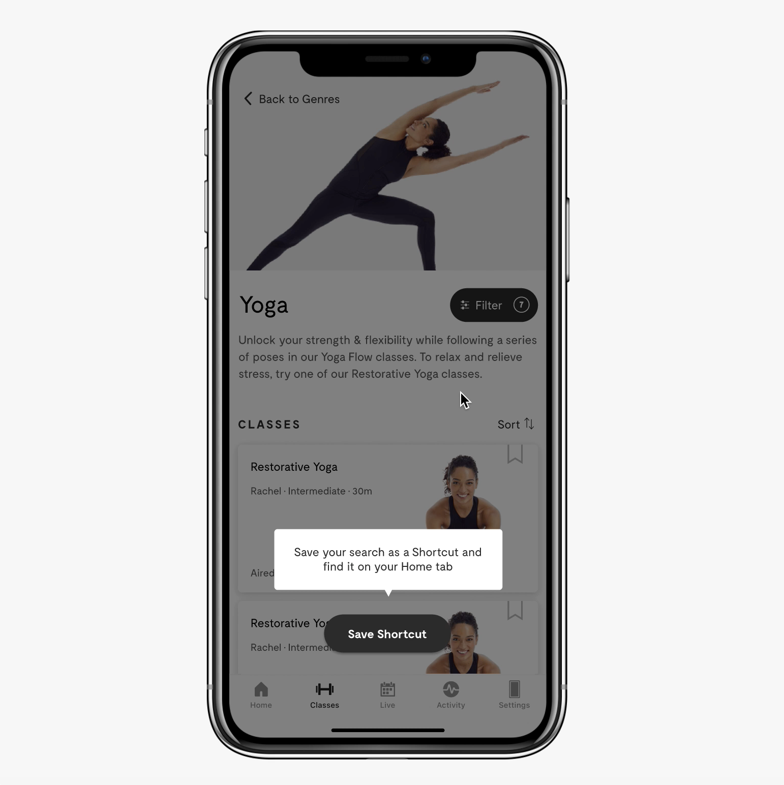
Open filters
First, we added a proper class description to each workout genre and re-positioned the Filter button closer to the top of the page. From there, we exposed our filters and ranked them in order of importance to our users. This broadcasts class variety, trainer diversity, and reduces the amount of clicks while applying more filters simultaneously.
Amount of clicks to finding a class
Old design
Average: 6-8 clicks (2-3 filters applied)
New design
Average: 5-7 clicks (5-7 filters applied)
Saving a search
MIRROR gave their users the option to save their filtered searches and give them quick-access to them when they open the app.
Where will it live?
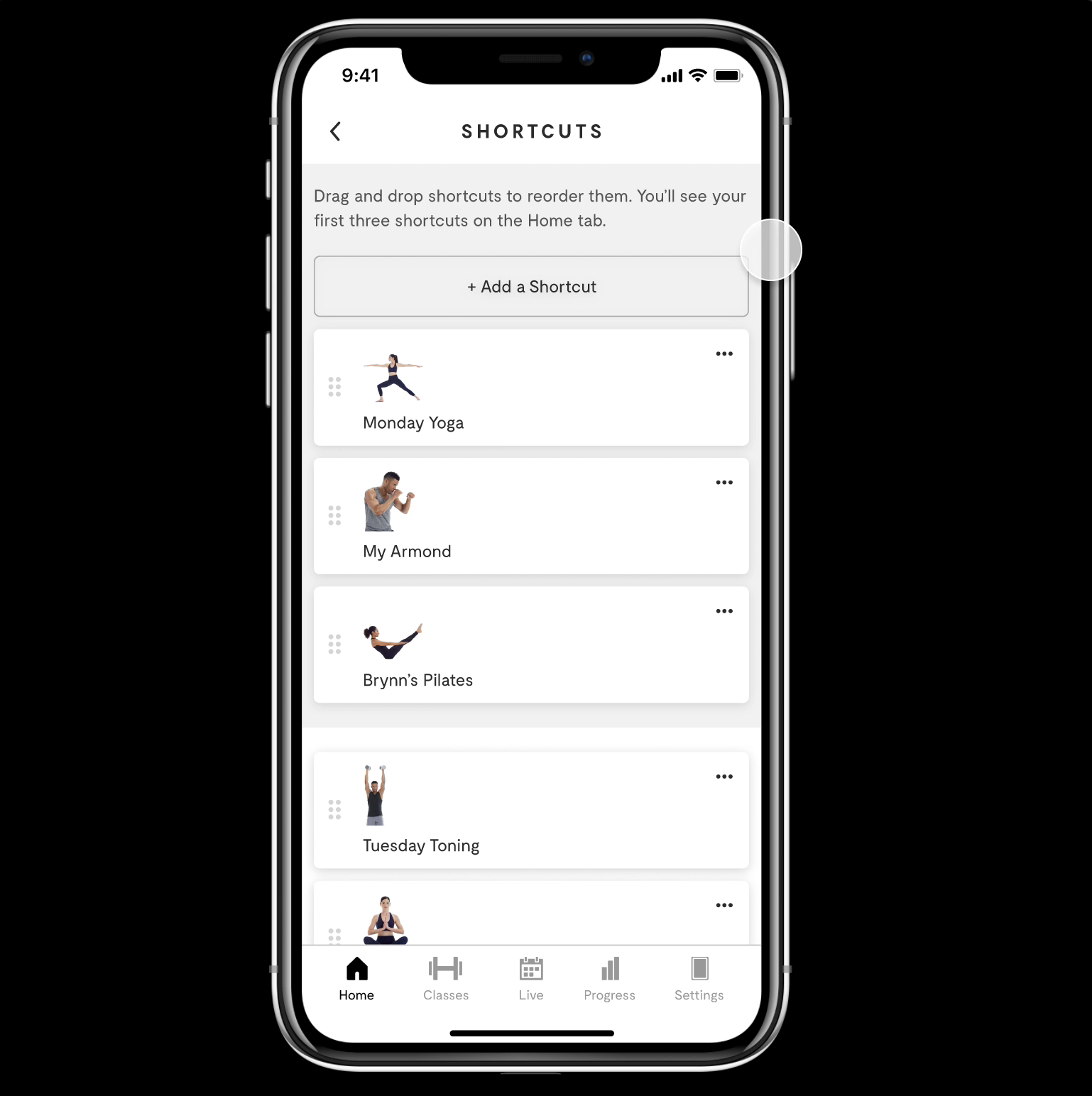
We carved out a new area on the Home Tab that is dedicated to both Bookmarks and Shortcuts. We wanted users to be able to quickly open the app and almost immediately be presented with the classes they love.
Bookmarks = Single classes
Shortcuts = A string of pre-selected filters that displays multiple classes.
Functionality and Issues
Educating our users
We designed an onboarding experience that teaches our users how to create a shortcut.
Problems we ran into
What happens when a user has a lot of shortcuts?
How do we allow them to manage them?
Solution:
The Shortcut Management page:
Displays all of the user’s Shortcuts.
Allows for re-arrangement and deletion of Shortcuts.
Explains which Shortcuts are displayed on Home and how to swap out.
Provides an “Add a Shortcut” CTA at the top for convenience.
File hand-off & ship-date
Every completed project is scrubbed clean and organized by iOS and Android. I work with a Product Manager to include annotations, flows, and anything that will help the engineers build to spec.
Ship-date for Filters: June 2021 ✅
Ship-date for Shortcuts: October 2021
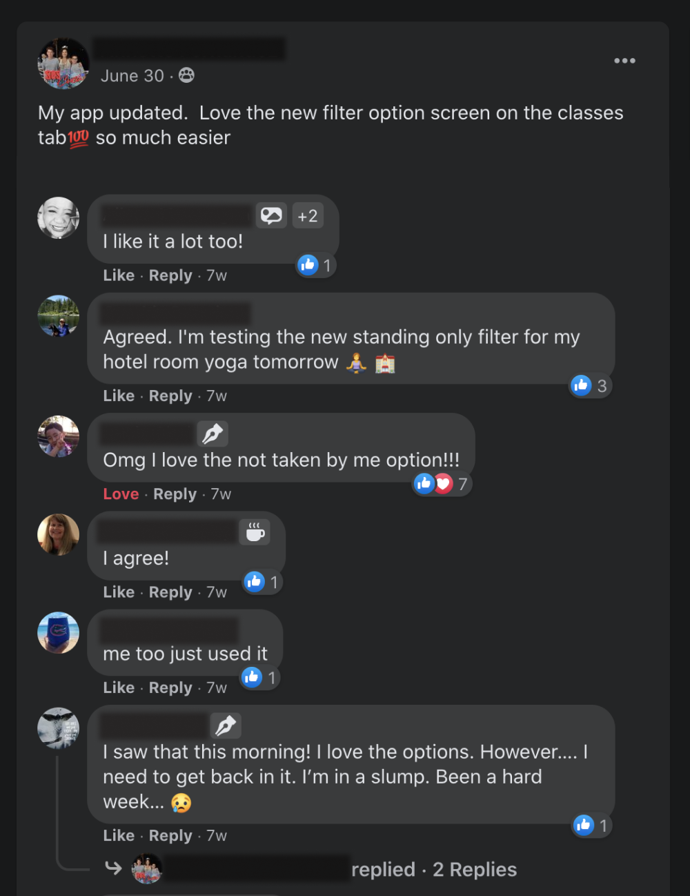
What people are saying
Overall, MIRROR users are loving the new filtering setup!